Our brief was to name and package a new milk brand from scratch — one that felt fresh, modern, and proudly local. After researching three potential names, Milkman emerged as the favorite for its simplicity, memorability, and everyday authenticity.
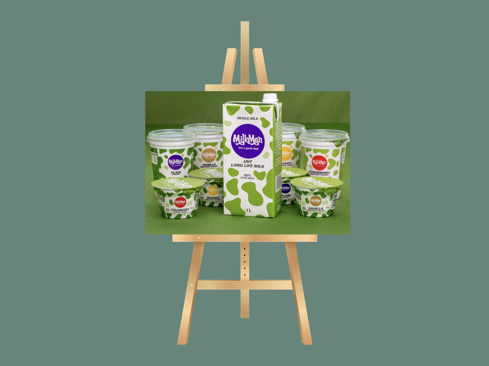
We developed five logo options and four distinct packaging directions, refining each through consumer focus groups to ensure market fit and appeal. The winning design — a bold green cow pattern — became Milkman’s signature visual asset, symbolizing freshness, quality, and consistency. From there, we built a comprehensive brand identity system, positioning strategy, and website to introduce Milkman to market as a confident, homegrown brand with a story customers could trust.